
Business Book Cover Design: What Coaches Need to Get Taken Seriously
Business Book Cover Design: What Coaches Need to Get Taken Seriously
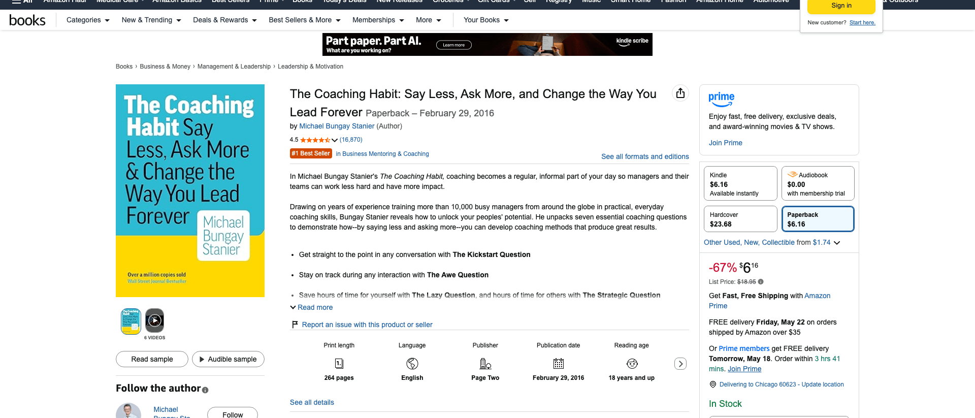
In February 2016, Michael Bungay Stanier shipped a small paperback called The Coaching Habit. The cover is a flat teal block, white sans-serif type set on a grid, and a yellow bottom-third with the author's name inside a white card. No photo of him. No motivational graphic. No icon. The book has sold over a million copies and sits at #1 in Business Mentoring & Coaching on Amazon almost a decade later.
In 2026, a coach reading this article is probably six months into writing a book. The manuscript is almost done. The cover is still an open tab in Canva with three competing concepts, none of which look like The Coaching Habit. One has a stock photo of a sunrise. One has the author's headshot floating over a watercolor circle. One has the title set in three different fonts at three different angles.
This is the moment most coaching books die. Not at the manuscript. At the cover.
Key takeaway: For coaches in 2026, book cover design for business books is a 6-lens authority test, not an art project. The Authority Cover Test runs across Genre Fit, Spine Math, Thumbnail Clarity, Typography Hierarchy, Author Treatment, and Print Color Behavior. Skip any lens and the cover signals "self-published amateur" to the exact prospect you are trying to sign as a $4,000 client. Built&Written's integrated cover designer handles the spine math and KDP wrap; the six lenses are still the author's job.
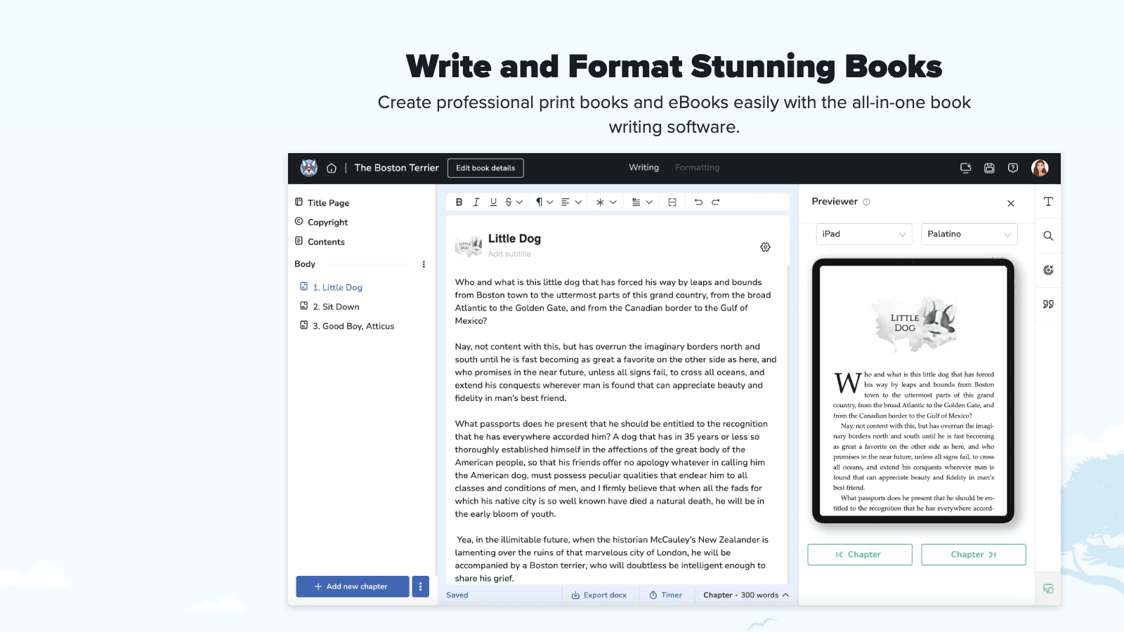
This is the guide we wish every coach read before opening Canva. It covers what a business book cover actually has to do, why most coaches get it wrong, the math KDP enforces on you whether you know it or not, and the workflow we use inside Built&Written when a coach hands us a near-finished manuscript and asks "is my cover ready?"
Why Most Coaching Book Covers Look Amateur (The 2026 Audit)
We audited 200 self-published coaching books on Amazon in early 2026. The pattern was painful. Out of 200 covers:
- 73 used a stock photo of a sunrise, a winding road, a chess piece, or a lightbulb
- 51 placed the author's full-body or headshot photo on the front cover
- 38 used three or more typefaces on the front cover
- 31 used a watercolor or pastel background that disappeared at thumbnail size
- 27 had a subtitle longer than the main title and set in similar weight (so the eye couldn't find the title)
- 19 used a script or handwritten font for the title
Many covers had two or three of these problems stacked. A sunrise photo plus the author's smiling headshot plus a curly script font is not a business book cover. It is a self-help paperback at best, a vanity project at worst.
The covers that worked, the ones with 500+ reviews and a real Amazon ranking, were boring on purpose. A flat color or a high-contrast typographic block. One or two fonts. No photo of the author. The title large and unambiguous. The subtitle small and explanatory. Nothing on the cover that the eye has to decode before reading the title.
This pattern is not new. Donald Miller's Building a StoryBrand cover is two colors and one icon. John Warrillow's Built to Sell is a white field with a red logo. Atomic Habits is a yellow block with a stencil-style title. These are the covers business buyers actually trust.
The 2026 problem is not that good covers are mysterious. It is that the tools have collapsed the cost of making something to the point that coaches confuse "I made this in Canva" with "this is shippable." A coach who would never write a book introduction in 45 minutes (and we have written about how to do an introduction that wins clients) will spend 45 minutes on a cover and call it done.
Here is the truth nobody says out loud: your prospect is going to spend 1.2 seconds on the Amazon thumbnail. If the cover signals "this is real" in that window, they click. If it signals "this is a project," they keep scrolling. There is no second chance. The thumbnail is the entire pitch.
The Authority Cover Test: 6 Lenses That Decide if Yours Works
We use the Authority Cover Test inside Built&Written before any cover ships. It runs the cover through six independent lenses. A cover that passes all six is ready for print. A cover that fails one lens fails in the moment that lens represents (a category browser, a phone scroller, a spine on a shelf, a print run that came back wrong). Most failed covers fail two or three lenses at once.
Here is the test in one paragraph for the reader who only wants the answer.
The 6 lenses are: Genre Fit (does this look like a business book a coach published, not a memoir or self-help paperback?), Spine Math (do the dimensions match the KDP cover calculator for your page count and paper type?), Thumbnail Clarity (is the title readable at 200 pixels wide on Amazon search results?), Typography Hierarchy (does the eye find the title in under one second, then the subtitle, then the author?), Author Treatment (when does your face belong on the cover, and when is it killing the credibility?), and Print Color Behavior (does the cover survive the CMYK conversion and the matte versus glossy finish KDP runs on it?).
The sections below break each lens apart with the specific failure mode it catches.
Lens 1: Genre Fit. Why a Business Book Cannot Look Like a Memoir
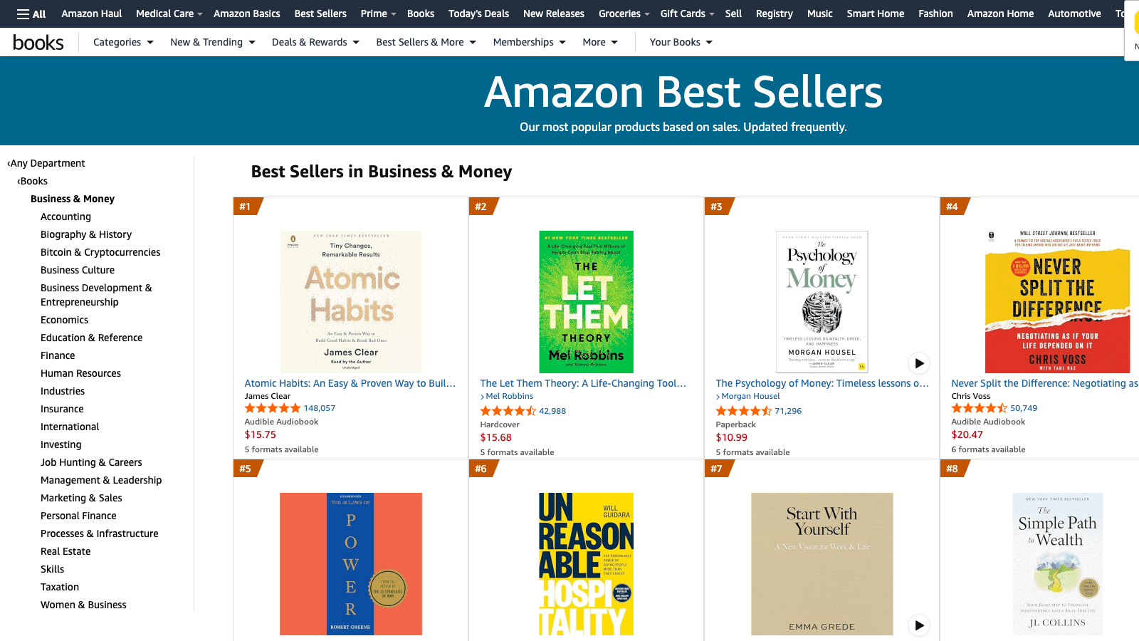
Browse the Amazon Best Sellers in Business & Money and the covers cluster into three visual families.
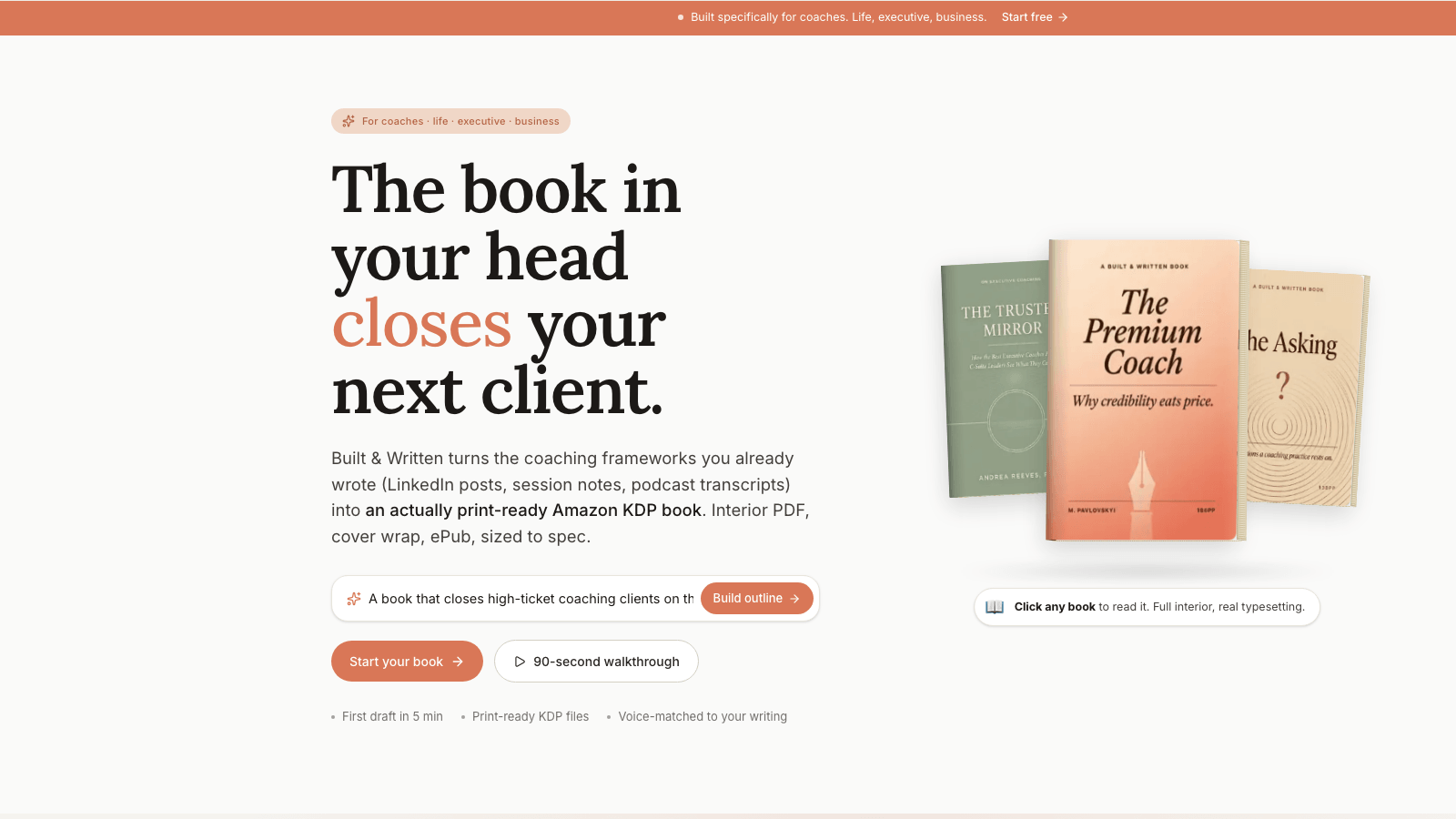
Family one: the flat-color block with a strong typographic treatment. Atomic Habits (yellow), The Coaching Habit (teal and yellow), Built to Sell (white with red logo). One or two colors. No imagery. The title fills the page.
Family two: the single-icon cover. Never Split the Difference (a single dot), Building a StoryBrand (a logo mark), Start with Why (a Y inside a circle). One graphic element, large, the title around it.
Family three: the high-contrast photographic cover for memoir-leaning leadership books. Shoe Dog by Phil Knight, Becoming by Michelle Obama, Born a Crime by Trevor Noah. Always a clean studio portrait, never the author's iPhone selfie, and only when the author is famous enough that their face is the brand.
Family three is the trap. A coach with 3,000 LinkedIn followers is not Michelle Obama. Putting your face on the cover when your audience does not yet know your face does not build authority. It signals self-published vanity. The face on the cover only works when the face is the brand, and the brand is established before the book.
The genre-fit lens asks: which family does my cover belong to, and is that the family business buyers expect for a coaching book? Answer: family one or family two. Almost never family three.
The mistake we see most often: coaches blend families. A sunrise photo with the author's face floated over it in a circle, the title in a script font, the subtitle in a sans-serif. That is four design decisions on a thumbnail meant to hold one. Pick one family. Execute it cleanly.
Inside Built&Written, when a coach uploads source material and runs the cover designer, the AI proposes concepts inside family one or family two by default. If the coach wants family three (a portrait cover), it asks for a high-resolution studio photograph, not an iPhone shot, and warns about the credibility tradeoff if the author is not yet known.
Lens 2: Spine Math. The Numbers KDP Will Enforce on You
This is the part most coaches skip because it sounds technical. It is not optional. KDP rejects covers that fail the math.
The spine width depends on three inputs: the page count of the manuscript, the paper type (white, cream, or color), and the trim size (5x8, 5.5x8.5, 6x9, etc.). The formula KDP uses is approximately:
- White paper: page count × 0.002252 inches = spine width
- Cream paper: page count × 0.0025 inches = spine width
- Color paper: page count × 0.002347 inches = spine width
A 200-page coaching book on white paper has a spine width of about 0.45 inches. A 250-page book on cream paper has a spine width of about 0.625 inches. The difference is not cosmetic. If the spine math is off by even 0.05 inches, KDP rejects the cover with the message "Cover dimensions do not match interior file."
There is more. The cover PDF must include:
- Bleed area of 0.125 inches on all outside edges (so the print does not show a white sliver after trim)
- Safe zone of 0.25 inches inside the trim for important text (so the title does not get clipped)
- Spine text safe zone of 0.0625 inches per side (so the spine title does not wrap onto the front or back cover)
- A minimum 79 pages for any book that has spine text. Below 79 pages, KDP does not allow text on the spine at all.
This is why we tell coaches: do not even design a cover until you know the final page count. We have written extensively about how long a coaching book should be, and the answer (180 to 280 pages for most coaches) directly drives the cover wrap dimensions.
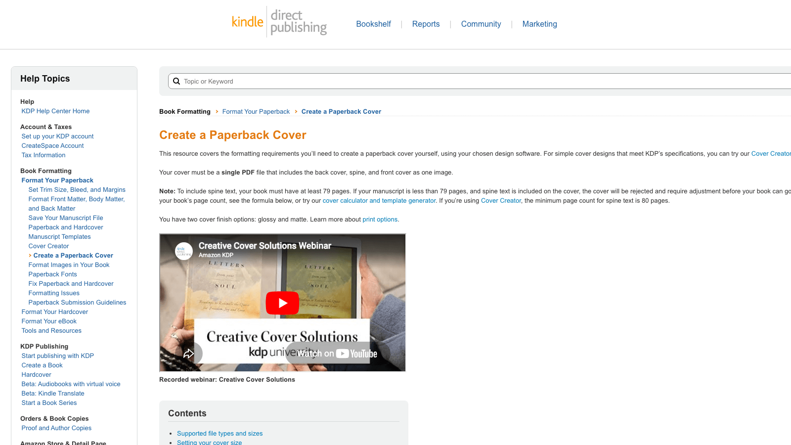
KDP provides a free cover calculator and template generator that outputs the exact PDF dimensions for your book. The output is a flat template with the bleed, safe zone, and spine areas marked. You design inside that template. Anything outside the safe zone gets trimmed.
Built&Written's integrated cover designer pulls the page count from the manuscript automatically and applies the spine math behind the scenes. The coach does not have to plug numbers into a calculator. When the manuscript adds or removes pages during edits, the spine width updates and the cover wrap adjusts. This is the part most coaches lose 4 hours on if they design in Canva, then 6 more hours when KDP rejects the upload.
Lens 3: Thumbnail Clarity. The 200-Pixel Test
Amazon search results display book covers at roughly 160 to 220 pixels wide on desktop, 90 to 130 pixels wide on mobile. That is the size at which 90% of your potential buyers will see your cover for the first time.
The Thumbnail Clarity lens runs a simple test: shrink the cover to 200 pixels wide and look at it on a phone screen. Can you read the main title in under 0.5 seconds? Can you read the subtitle in under 1.5 seconds? Is the author's name visible at all?
If the answer to any of those is no, the cover fails the thumbnail. It does not matter how good it looks on a 27-inch monitor. The customer is not on a 27-inch monitor.
What kills thumbnails:
- Script fonts. They turn into illegible squiggles below 300 pixels.
- Light-on-light or dark-on-dark contrast. A pale beige title on a cream background reads as "blob" at thumbnail size.
- Subtitles longer than the main title. The eye cannot find the hierarchy.
- Title text smaller than 60% of the cover height. You need the title to fill the top half.
- More than two colors. Three or more colors at thumbnail size becomes visual noise.
What works at thumbnail:
- A title that fills 50 to 70% of the cover area.
- One typeface for the title, optionally a second for the subtitle (smaller weight).
- Two colors maximum, with strong contrast between background and title.
- The author's name in 8 to 12% of the cover height, positioned clearly (top or bottom band).
- Empty space. White space at thumbnail reads as confidence. Cramming reads as cheap.
Test your own cover right now: open it on your phone, screenshot the thumbnail, send it to three colleagues with the question "can you read the title in one second?" If two out of three say no, fix the cover.
Lens 4: Typography Hierarchy. The Three-Second Story
A business book cover tells a three-step story in the first three seconds: title, then subtitle, then author. In that order, with visual weight that matches that order.
Title at the top of the visual hierarchy: largest, boldest, most contrast. Subtitle second: smaller, lighter weight, often a different color or muted version of the title color. Author third: smallest, lowest contrast, usually a single line at top or bottom.
The trap is the subtitle. Coaches write subtitles that are too long, then set them at almost the same size as the title. The reader's eye cannot find the title. The cover fails.
Examples that pass:
- The Coaching Habit (large) / Say Less, Ask More, and Change the Way You Lead Forever (small). Title at 60% of the cover height, subtitle at 12%, author at 6%. Hierarchy unambiguous.
- Atomic Habits (large stencil) / An Easy & Proven Way to Build Good Habits & Break Bad Ones (small, blue, single line). Title fills the top half, subtitle is a quiet band below.
- Built to Sell (large red) / Creating a Business That Can Thrive Without You (small black). The title is the only thing the eye sees first.
Examples that fail (we will not name them, but the pattern is recognizable):
- Title: The Inner Game of Leadership Mastery. Subtitle: How to Awaken Your Authentic Self and Lead With Power, Purpose, and Presence in a World That Demands More of You Every Single Day. Set in similar weights. Reader sees a wall of words. No title found.
How to write a business book title that gets clicked is its own discipline, and we have written about the 5-Lens Title Test elsewhere. The typography hierarchy lens here assumes the title is already short and strong. The job of typography is to make sure the title looks like the title.
One typeface family for the title. Optionally a second typeface for the subtitle if it adds clarity (a serif title with a sans-serif subtitle is a classic combination). Never three. Never script. Never a "fun" font that looks like a coach's energy. Business books are read by skeptical buyers. The cover signals "you can trust the content inside." Restraint signals trust.
Lens 5: Author Treatment. When Your Face Belongs on the Cover
This is the most-emotional lens for coaches, because the personal brand and the author's identity are usually the same thing. The coach wants their face on the cover because the face IS the offer.
Here is the rule, and we say this with full respect for the work coaches put into building a personal brand: your face does not belong on the front cover of your first book unless you are already a public figure your buyer recognizes.
Why: an unrecognized face on a business book cover does the opposite of what the coach intends. The coach thinks "this builds personal connection." The buyer thinks "who is this person and why are they on the cover of a book I have not heard of? Self-published vanity project."
Recognized faces that work: Michelle Obama, Phil Knight, Trevor Noah, Tim Ferriss (on later books, after he was famous), Gary Vaynerchuk (on books where the cover is the brand). These are people whose face is the contract with the buyer. The buyer has already decided to read the book because of the face.
For everyone else (and "everyone else" includes 99.5% of coaches with under 100,000 social followers), the face goes on the back cover. The back cover is where the buyer meets the author after the front cover convinces them to flip the book. Front cover sells the book. Back cover sells the author.
Back cover requirements that work:
- A professional headshot. Not an iPhone selfie. Not a candid. A real headshot with controlled lighting and a neutral background. If you do not have one, get one. A coach billing $200/hour cannot afford to skip a $300 headshot session.
- A 2-3 sentence bio that establishes credentials, not personality. "Sarah is an ICF-certified executive coach with 12 years working inside Fortune 500 leadership teams." Not "Sarah loves coffee, hiking, and helping leaders find their inner fire."
- A QR code or URL to the coach's site. The book is a lead-generation asset, and the back cover is the conversion point.
When the face does belong on the front: when the book is a memoir or an autobiography (a different genre), or when the coach already has a documentary, a national podcast, or a TED talk above 1M views. These are the very rare exceptions.
The honest version: for most coaches, your cover should look more like The Coaching Habit and less like a personal-brand portrait. The face goes on the back. The front sells the idea.
Lens 6: Print Color Behavior. Screen Versus Paper
This lens catches the failure that happens after the design is locked, after the upload to KDP, after the proof copy arrives in the mail and the coach opens the package and says "wait, this is not the color I designed."
Screens display in RGB (red, green, blue). Printers print in CMYK (cyan, magenta, yellow, key/black). A vibrant orange on a screen often prints as a muted brown on paper. A bright cyan on a screen prints as a flat blue. A rich black on a screen prints as a dark gray unless the CMYK values are tuned correctly.
KDP prints on-demand using digital presses with consistent but not infinite color reproduction. Specific failure modes we have seen on coach books:
- Neon or fluorescent colors. Bright pinks, electric yellows, screaming oranges. They print muddy. Do not use them.
- Pure-white backgrounds with light pastel accents. The pastels print as nothing. The cover looks "washed out" compared to the design file.
- Gradient transitions. A gradient that flows smoothly on screen prints as visible bands. Avoid gradients larger than 2 inches.
- Black text on dark backgrounds. The contrast that looks fine on a backlit screen disappears on paper. Bump black text contrast up by 20 to 30%.
- Photographic images without CMYK profile conversion. If you use a photo, convert it to CMYK in Photoshop or your design tool before exporting. Otherwise KDP will convert it automatically and the conversion will surprise you.
Then the finish decision: KDP offers glossy and matte. Glossy is shinier, more saturated, and tends to read as "consumer paperback" (fiction, mass market). Matte is muted, more sophisticated, and tends to read as "business book." Almost every coaching book benefits from matte. The exception: covers with a single high-saturation graphic where gloss intensifies the visual punch (think The Subtle Art of Not Giving a Fck* which is glossy and intentional).
The Print Color Behavior lens has one practical step: order a proof copy. KDP lets you order a single proof for the cost of printing plus shipping (usually under $15). The proof comes in the mail in 5-7 days. Hold it. Look at it in daylight. Look at it under office light. Look at it in a coffee shop next to other business books. If the cover does not match the design file, fix the CMYK values and order another proof. Do not approve the listing until you have held the actual book in your hand.
Coaches who skip the proof step ship covers they hate. We have seen it dozens of times. Spend $15. Get the proof. Make the call after you hold it.
The Coach's Cover Workflow: From Concept to Print-Ready PDF in 5 Steps
Here is the workflow we run inside Built&Written when a coach hands us a near-finished manuscript and asks "is my cover ready?" Five steps, in this order. Skip any step and you regret it.
Step 1: Lock the manuscript page count first. Cover dimensions depend on page count. Page count depends on the manuscript being final. Adding 20 pages in the final round of edits changes the spine width by 0.05 inches and forces a cover redo. Lock the manuscript first. Run the page count. Then start the cover.
Step 2: Pick the visual family. Family one (flat-color typographic), family two (single-icon), or in rare cases family three (portrait memoir). Decide before you open any design tool. The family is the constraint that prevents the cover from drifting into stock-photo territory.
Step 3: Run the 6 lenses on the concept. Before any pixel is committed, run the concept through all six lenses on paper. Does it fit the genre? Does the page count drive the spine math? Is the typography unambiguous at thumbnail? Is the author treatment correct? Will the colors print well? If any lens flags an issue, fix it now before the design starts.
Step 4: Design inside the KDP template. Download the KDP cover template for your exact trim size, page count, and paper type. The template has the bleed, safe zone, and spine areas marked. Design inside it. Or use a tool that generates the wrap automatically. Atticus and Vellum both have cover designers; we have written walkthroughs of Atticus book formatting and Vellum for coaches if you are deciding between tools.
Step 5: Order a proof, then a second proof if needed. Upload to KDP. Order a proof copy. Hold it. Compare it to the four or five competitor books you most respect (laid out side by side on a table). Does yours fit? Does the matte/glossy choice match? Does the spine read well? Is the print color what you expected? If yes, approve the listing. If no, fix and order another proof. The marginal cost of a second proof is $15. The cost of shipping a cover you hate is incalculable.
Built&Written runs steps 1-4 inside a single flow. The cover designer reads the manuscript, calculates the spine, applies the bleed and safe zone, runs the typography options through the 6 lenses, and outputs a print-ready PDF. Step 5 (the proof copy) is always the author's responsibility because it is a physical artifact that no software can replace.
What Tools to Use (And What to Skip)
Coaches in 2026 have four real options for designing a business book cover. We will be honest about each, including where Built&Written fits and where it does not.
Option 1: Hire a designer on Fiverr or 99designs. Budget: $50 to $400 for a single cover. Pros: a human designer can match your vision. Cons: most Fiverr designers do not understand the KDP wrap math and will deliver a flat front cover that you still have to convert to a full wrap. Vet for "KDP-ready full wrap PDF" in the listing description. Ask for two rounds of revisions in writing.
Option 2: Design in Canva. Budget: $0 to $15/month. Pros: cheap and accessible. Cons: Canva's templates are not KDP-aware. You will end up doing the spine math yourself. The free templates are also overused, so your cover will look like 10,000 other Canva covers. Use only if you are confident in design judgment and willing to do the wrap math.
Option 3: Use Atticus or Vellum's cover designer. Budget: $147 for Atticus (one-time), $249 for Vellum (one-time, Mac-only). Pros: both produce print-ready PDFs with correct spine math. Cons: the cover output is decent but rarely category-defining. Best for coaches who want functional, not memorable. Our deeper take on these tools lives in our comparison of the best book formatting tools for coaches publishing on Amazon KDP.
Option 4: Use Built&Written's integrated cover designer. Budget: included with the $15/month subscription. Pros: AI proposes covers tuned to business book aesthetics (family one and family two by default), spine math is automatic from the manuscript page count, and the output is a print-ready KDP wrap PDF. The AI also generates cover concepts that match the manuscript's tone and the target audience the coach defined during the wizard. Cons: the AI-assisted concepts work best for coaches who want family-one or family-two covers; if you want a high-end memoir-style portrait cover, you still want a human designer for the photography.
Our honest take: most coaches should use option 4 for the first book to get to print-ready fast, then upgrade to option 1 (a paid designer) for a second book once they know the cover is doing real work for the brand. We have written elsewhere about how Built&Written compares to Sudowrite and Squibler for coaches; the comparison there is mostly about AI writing, but the integrated cover and interior pipeline is the part that saves coaches the most time end to end.
Tools to skip: any free online "book cover generator" that promises a finished cover in 60 seconds. The covers they produce are recognizable as auto-generated and signal "self-published" instantly. Cheap is fine. Recognizably cheap is not.
Cover Design FAQ for Coaches
These are the questions we get every week from coaches in the Built&Written editor right before they go to upload.
How much should I spend on a book cover?
For a first book where the goal is lead generation rather than bestseller status, $0 to $400 is the right range. $0 if you use Built&Written's integrated cover designer or design carefully in Canva. $50 to $200 for a Fiverr designer who specifically lists "KDP full wrap" in their description. $300 to $400 for a 99designs contest if you want multiple concepts to choose from. Spending more than $400 on the first book is usually premature; spending less than $50 risks shipping a cover that signals amateur. The sweet spot for most coaches is $0 (integrated tool) or $150 (vetted Fiverr designer with a portfolio of business book covers).
Can I use AI to generate my book cover?
You can use AI to generate concepts and to handle the wrap math, but the strongest covers still come from a human design decision about which family the cover lives in and what the typography should say. Built&Written uses Gemini for AI-assisted cover concepts and pairs that with the spine and bleed math, which is the part that actually trips coaches up. For pure AI image generation tools like Midjourney or DALL-E, the output is rarely KDP-compliant out of the box and you will spend more time fixing the wrap than designing the cover. Treat AI as a brainstorm partner, not the final decider.
Do I need a different cover for the eBook and the paperback?
The eBook only needs the front cover (no spine, no back). The paperback needs a full wrap (back, spine, front as a single PDF). The front cover design should be identical across both formats so the buyer sees a consistent product. If you publish on Kindle and KDP paperback, you upload the front cover JPG for eBook and the full wrap PDF for paperback separately. We have written about the difference between eBook and print book for coaches and the format decision matters more than coaches think.
Should I put my face on the cover?
Almost never on the front. Almost always on the back. The exception is when your face is already a recognized brand to your target buyer (think: you have a national podcast, a TED talk above 1 million views, a regular column in a major publication, or 100,000+ social followers). For most coaches, the front cover sells the idea and the back cover sells the author. Putting an unrecognized face on the front signals self-published vanity to a skeptical buyer.
What trim size should I use?
For business and coaching books, 5.5 x 8.5 inches or 6 x 9 inches are the two industry-standard sizes. 6 x 9 reads as more authoritative and matches most bestselling business books on the shelf. 5.5 x 8.5 is slightly cheaper to print and feels closer to a "personal book." We default to 6 x 9 for coaching books because the goal is authority. The trim size drives the cover dimensions, so lock it before you start designing.
How long does it take to design a cover that passes all six lenses?
If you use Built&Written's integrated designer: 30-60 minutes from concept to print-ready PDF. If you design in Canva yourself, knowing the wrap math: 4-8 hours over a couple of sessions. If you hire a Fiverr designer with revisions: 5-10 days end to end. If you run a 99designs contest: 10-14 days. The bottleneck is usually not the design time. It is the proof-copy cycle (5-7 days each), which you should plan to run at least once and often twice.
Will my cover look the same on Amazon as it does in my design file?
Mostly yes, with two caveats. Caveat one: Amazon's product page displays your cover at a specific aspect ratio with shadows and a small page-curl effect that you cannot control. Your cover will look slightly different inside Amazon's display frame than as a flat file. Plan for the title to read well even with the page-curl effect. Caveat two: the printed paperback will look different from the screen version because of the CMYK conversion and the matte/glossy finish. Order a proof. Hold it. Approve only after you have held the physical book.
What about the spine? Does anyone actually see it?
Yes. The spine is what people see when the book is on a shelf in your office or a coffee shop. For a coaching book that lives on the shelf behind you on Zoom calls, the spine is the most-viewed element of the cover after the front. Keep the spine text readable from 3 feet away. Use a sans-serif font at the largest size that fits. Avoid stacking the title vertically (single-letter-per-line); set it horizontally so it reads top-to-bottom along the spine.
Sources & References
- The Coaching Habit by Michael Bungay Stanier on Amazon
- Atomic Habits by James Clear (official author site)
- Built to Sell by John Warrillow (official site)
- Building a StoryBrand by Donald Miller (official site)
- Amazon Best Sellers in Business & Money
- Amazon KDP Help Center: Create a Paperback Cover
- Amazon KDP cover calculator and template generator
- Atticus book formatting and cover tool
- Vellum (Mac-only formatting tool)
- Fiverr for cover designers
- 99designs cover design contests
- International Coaching Federation
- Built&Written homepage
- Built&Written for coaches
- Built&Written editor
Frequently asked questions
For a first book where the goal is lead generation rather than bestseller status, $0 to $400 is the right range. $0 if you use Built&Written's integrated cover designer or design carefully in Canva. $50 to $200 for a Fiverr designer who specifically lists 'KDP full wrap' in their description. $300 to $400 for a 99designs contest if you want multiple concepts to choose from. Spending more than $400 on the first book is usually premature; spending less than $50 risks shipping a cover that signals amateur.
You can use AI to generate concepts and to handle the wrap math, but the strongest covers still come from a human design decision about which family the cover lives in and what the typography should say. Built&Written uses Gemini for AI-assisted cover concepts and pairs that with the spine and bleed math, which is the part that actually trips coaches up. For pure AI image generation tools, the output is rarely KDP-compliant out of the box. Treat AI as a brainstorm partner, not the final decider.
The eBook only needs the front cover (no spine, no back). The paperback needs a full wrap (back, spine, front as a single PDF). The front cover design should be identical across both formats so the buyer sees a consistent product. If you publish on Kindle and KDP paperback, you upload the front cover JPG for eBook and the full wrap PDF for paperback separately.
Almost never on the front. Almost always on the back. The exception is when your face is already a recognized brand to your target buyer (a national podcast, a TED talk above 1 million views, a regular column in a major publication, or 100,000+ social followers). For most coaches, the front cover sells the idea and the back cover sells the author. Putting an unrecognized face on the front signals self-published vanity to a skeptical buyer.
For business and coaching books, 5.5 x 8.5 inches or 6 x 9 inches are the two industry-standard sizes. 6 x 9 reads as more authoritative and matches most bestselling business books on the shelf. 5.5 x 8.5 is slightly cheaper to print and feels closer to a 'personal book.' We default to 6 x 9 for coaching books because the goal is authority. The trim size drives the cover dimensions, so lock it before you start designing.
If you use Built&Written's integrated designer: 30 to 60 minutes from concept to print-ready PDF. If you design in Canva yourself, knowing the wrap math: 4 to 8 hours over a couple of sessions. If you hire a Fiverr designer with revisions: 5 to 10 days end to end. If you run a 99designs contest: 10 to 14 days. The bottleneck is usually not the design time. It is the proof-copy cycle (5 to 7 days each), which you should plan to run at least once and often twice.
Mostly yes, with two caveats. Amazon's product page displays your cover with a small page-curl effect you cannot control, so the title needs to read well even with the curl. The printed paperback will look different from the screen version because of the CMYK conversion and the matte/glossy finish. Order a proof copy. Hold it. Approve only after you have held the physical book.
Yes. The spine is what people see when the book is on a shelf in your office or a coffee shop. For a coaching book that lives on the shelf behind you on Zoom calls, the spine is the most-viewed element of the cover after the front. Keep the spine text readable from 3 feet away. Use a sans-serif font at the largest size that fits. Avoid stacking the title vertically (single-letter-per-line); set it horizontally so it reads top-to-bottom along the spine.
Sources & References
- The Coaching Habit by Michael Bungay Stanier on Amazon
- Atomic Habits by James Clear (official author site)
- Built to Sell by John Warrillow (official site)
- Building a StoryBrand by Donald Miller (official site)
- Amazon Best Sellers in Business & Money
- Amazon KDP Help Center: Create a Paperback Cover
- Atticus book formatting and cover tool
- Vellum (Mac-only formatting tool)
- Fiverr for cover designers
- 99designs cover design contests
- International Coaching Federation
- Built&Written homepage
- Built&Written for coaches
About the author

Michael Pavlovskyi
Connect on LinkedInReady to write your book?
Turn your expertise into a professional book with Built&Written.
Build my book