

What Font Are Books Written In? The Answer Is Usually One of Five
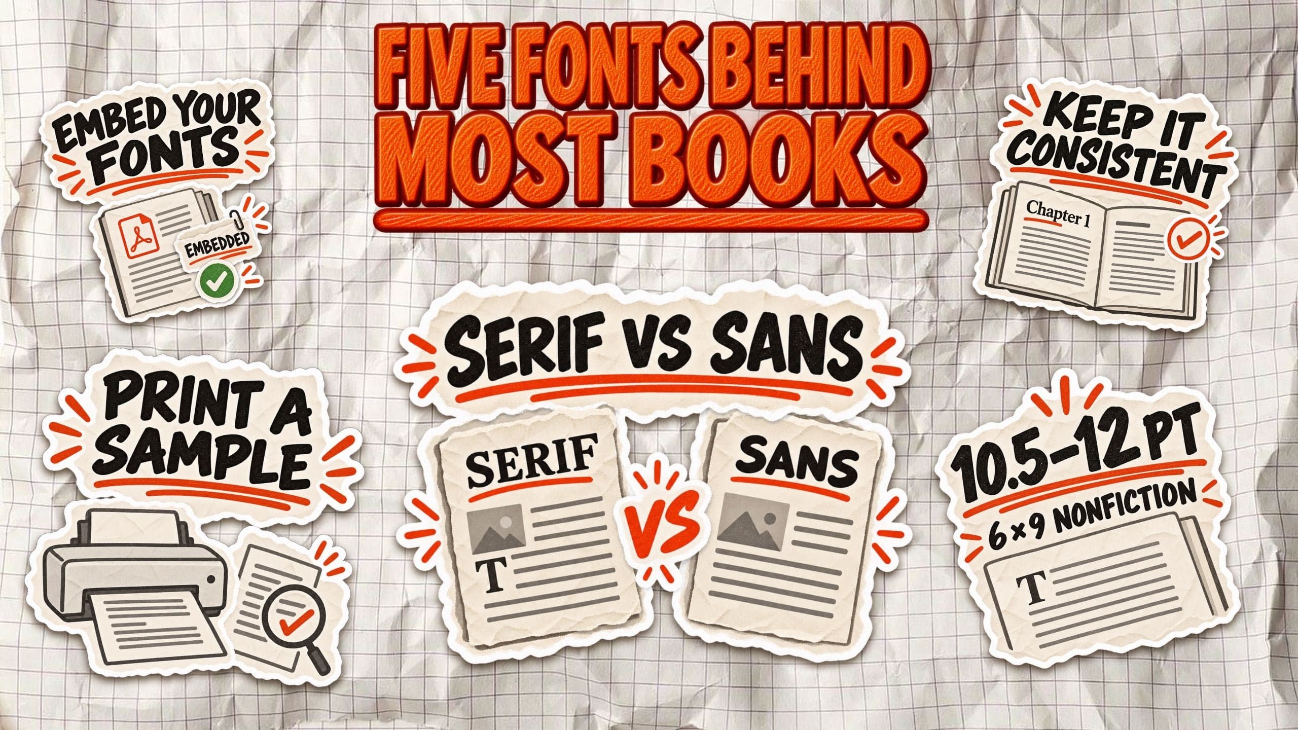
Most printed books use serif fonts, but there's no single typeface that every publisher follows. Garamond, Caslon, Baskerville, Minion, and Sabon are established choices, alongside other fonts designed for comfortable, long-form reading.
Your book's font does more than change how the pages look. It affects readability, gives readers an impression of professionalism, and determines how much text fits on each page. That last detail can change your total page count and printing costs.
In this guide, we'll compare five book fonts, explain what size and line spacing work best for a 6 × 9 nonfiction book, and show you how to prepare your typography for Amazon KDP.
What font are most books written in?
Most professionally printed books use serif fonts, particularly for body text. Their small finishing strokes have been part of book typography for centuries, giving printed pages a familiar, traditional appearance. Serif typefaces also offer a wide range of designs suited to long passages of text.
Garamond, Caslon, Baskerville, Minion, and Sabon are established choices in book publishing. Other typefaces are used too, depending on the genre, publisher, and intended reading experience. There's no universal font that every published book must follow.
It's also worth separating a book's body font from its display typography. The main text typically uses one consistent typeface, while chapter titles, headings, and the cover may use something entirely different.
And there's a difference between choosing a font in Word and preparing a finished book. Professional typesetting considers font size, line spacing, margins, and page layout together. A default manuscript font isn't necessarily the best choice for the printed edition.
The five fonts commonly used in printed books
Not every publisher uses the same typeface, but certain serif fonts have earned a lasting place in book design. Here are five established choices, with real published editions that document their use.
1. Garamond
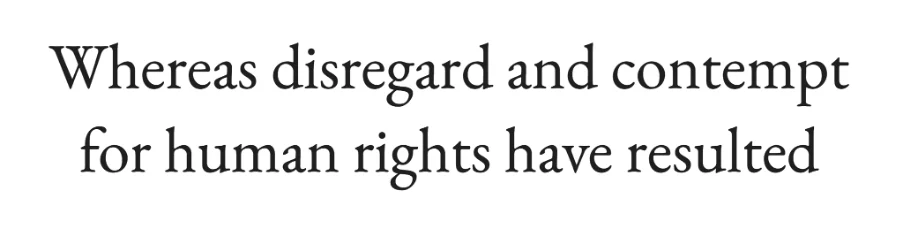
Garamond is a classic old-style serif known for its elegant letterforms, relatively compact proportions, and traditional appearance. It's a practical choice for long-form nonfiction because it can fit substantial text into a comfortable page layout.
However, Garamond isn't one single font. Adobe Garamond, EB Garamond, and Garamond 3 are different interpretations with distinct proportions and licensing arrangements.
Real book examples:
- Parenting Stress by Kirby Deater-Deckard (Yale University Press, 2004), set in Garamond.
- Basic & Clinical Pharmacology, 14th edition (McGraw-Hill, 2018), set in Adobe Garamond.
2. Caslon
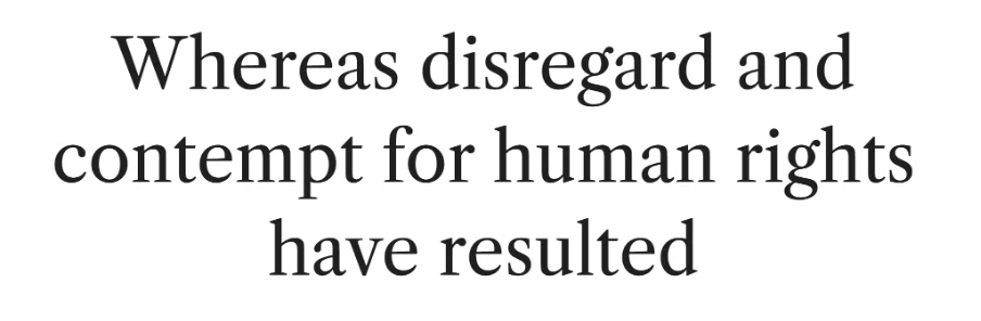
Caslon dates to the eighteenth century and remains associated with traditional British typography. Its sturdy letterforms and understated character make it particularly appropriate for history, biography, and authoritative nonfiction.
Commercial versions include Adobe Caslon, while Libre Caslon Text offers a free, independently designed alternative.
Real book examples:
- Florence Farr, Bernard Shaw and W. B. Yeats (Cuala Press, 1941), whose colophon confirms Caslon.
- Starship Troopers by Robert A. Heinlein, in Suntup Editions' limited edition, set in Adobe Caslon.
3. Baskerville
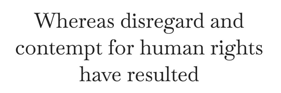
Baskerville is a transitional serif with sharper details and greater contrast between thick and thin strokes than many older typefaces. It creates a polished, formal appearance suitable for serious nonfiction and literary works.
Modern digital versions differ from John Baskerville's original eighteenth-century designs. Libre Baskerville is a freely available adaptation worth testing.
Real book examples:
- Stages on the Road by Sigrid Undset (Knopf, 1934), set in 11-point Linotype Baskerville.
- Seed by Ania Ahlborn, in Suntup Editions' limited edition, set in Baskerville.
4. Minion

Designed by Robert Slimbach for Adobe, Minion combines traditional book typography with modern digital typesetting features. Its extensive character sets, italics, and weights make it particularly useful for technical nonfiction, business books, and complex interiors.
Unlike open-source fonts, Adobe Minion requires appropriate licensing, although Adobe Fonts permits PDF embedding under its terms.
Real book examples:
- Enterprise Service Bus by David A. Chappell (O'Reilly, 2004), set in Adobe Minion.
- AppleScript: The Missing Manual by Adam Goldstein (O'Reilly), also using Adobe Minion for body text.
5. Sabon

Sabon was designed by Jan Tschichold in the 1960s, drawing on Renaissance typography. Its balanced proportions and restrained character make it particularly suitable for books where the text should take precedence over the design.
Sabon is generally a commercially licensed typeface. Free Garamond-inspired fonts offer alternatives, but aren't identical replacements.
Real book examples:
- The Cathedral & the Bazaar by Eric S. Raymond (O'Reilly), whose colophon identifies Adobe Sabon.
- Free as in Freedom by Sam Williams (O'Reilly, 2002), also set in Adobe Sabon.
Book font comparison
| Font | Visual character | Best suited for | Licensing and free options |
|---|---|---|---|
| Garamond | Classic, compact, elegant | General nonfiction, memoirs | EB Garamond is free; Adobe versions require licensed access |
| Caslon | Traditional, authoritative | History, biography, business | Libre Caslon Text is free; Adobe Caslon is commercial |
| Baskerville | Refined, high-contrast | Literary and formal nonfiction | Libre Baskerville is free; other versions vary |
| Minion | Balanced, versatile | Technical and dense nonfiction | Adobe licensing; no identical Google Fonts version |
| Sabon | Restrained, classical | Text-heavy nonfiction | Commercial; free stylistic alternatives exist |
The practical choice: For a first nonfiction book, start by testing Garamond, Caslon, or Minion. The best result depends on the particular font version, page dimensions, and spacing, not simply the typeface's reputation.
What font size should you use for a 6 × 9 book?
For a standard 6 × 9-inch nonfiction book, 10.5–12 points is a practical starting range for body text. Most business books and other text-heavy nonfiction will look comfortable somewhere within that range, depending on the typeface and page layout.
But point size doesn't tell the whole story. An 11-point Garamond can look noticeably smaller than an 11-point Baskerville because fonts differ in x-height (the height of lowercase letters), character width, and overall proportions.
Line spacing, also called leading, matters just as much. It measures the distance between consecutive lines of text, usually from one baseline to the next.
Here are three starting combinations for a 6 × 9 book:
| Font size | Leading | Typical use |
|---|---|---|
| 10.5 pt | 13.5 pt | Compact, text-heavy nonfiction |
| 11 pt | 14 pt | General nonfiction and business books |
| 12 pt | 15 pt | More spacious, accessible layouts |
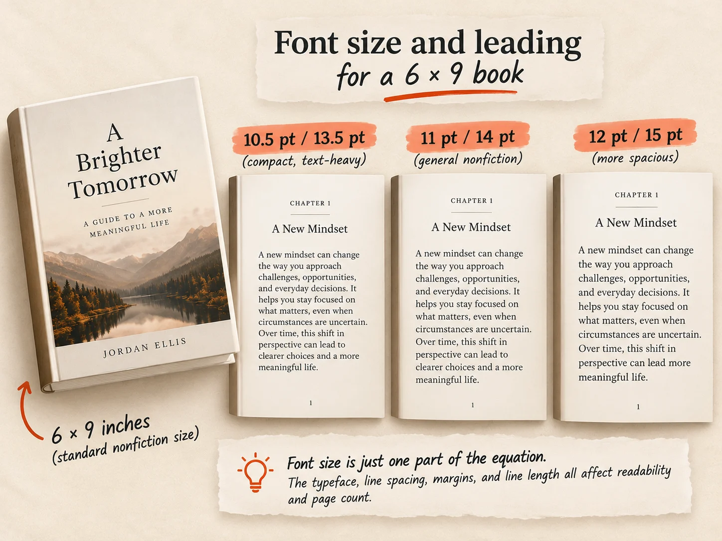
These are starting points, not fixed rules. Margins and line length also affect readability. Narrow margins can create overly long lines, while generous leading can make a page feel unnecessarily stretched.
Larger type and wider spacing may increase your page count, which can raise printing costs. Amazon KDP's printing-cost formula accounts for page count.
Amazon KDP requires a minimum font size of 7 points for paperback interiors, but that is a technical minimum, not a recommended body-text size.
Serif vs. sans serif: Which works better for books?
The difference is in the letterforms. Serif fonts have small strokes at the ends of letters, while sans serif fonts have cleaner shapes without those finishing details.
Serif fonts like Garamond, Caslon, and Baskerville have traditionally been popular for printed nonfiction. Their familiar appearance suits long chapters and continuous reading, although that doesn't mean they're always more readable than sans serif alternatives.
Sans serif fonts, such as Helvetica or Source Sans 3, work particularly well for headings, captions, diagrams, and workbook exercises. They're also used for body text in some modern business books, especially those with shorter sections and more visual elements.
The important factors are consistent typography, appropriate font size, comfortable line spacing, and strong contrast between text and paper.
A practical rule: For a text-heavy nonfiction book, start with a serif font for the body and consider sans serif for headings. For a workbook or highly visual guide, test a sans serif body font too.
What is the best font for a business book?
For a text-heavy business book, Garamond, Caslon, or Minion are sensible starting points. These serif fonts give long chapters a clean, established appearance without drawing attention away from the ideas.
But the right choice depends on the kind of book you're writing. A business strategy book with detailed explanations benefits from a restrained body font. A coaching guide with reflection questions and exercises may need more visual separation. A memoir generally calls for comfortable, uninterrupted reading, while a workbook might benefit from a modern sans serif.
Typography also affects how readers perceive your expertise. A consistent, well-organized interior can make your ideas easier to follow, while cluttered formatting may distract from otherwise valuable content.
Keep your font choices simple: use one typeface for body text and, if necessary, a complementary font for headings. Tables, callout boxes, exercises, and numbered frameworks should follow the same visual system.
Your font is only one part of the finished page. Margins, spacing, headings, and overall hierarchy matter just as much.
Can you use any font on Amazon KDP?
Amazon KDP doesn't require a specific typeface. You can use Garamond, Caslon, Baskerville, Minion, Sabon, or another readable font, provided it meets Amazon's technical requirements and you have permission to use it.
For printed books, KDP requires all fonts to be embedded in the interior file and sets a minimum text size of 7 points. Embedding preserves the intended typography when Amazon prints your book.
However, commercial use and font embedding are different licensing permissions. Being allowed to use a font in a book doesn't automatically mean you can distribute its font files.
Here's how the five typefaces compare:
| Typeface | Licensing considerations |
|---|---|
| Garamond | EB Garamond is free; Adobe Garamond requires licensed access |
| Caslon | Libre Caslon Text is free; Adobe Caslon is commercial |
| Baskerville | Libre Baskerville is free; commercial versions vary |
| Minion | Adobe Fonts licensing covers qualifying PDF and ebook embedding |
| Sabon | Commercial licensing generally applies; check your version |
Google Fonts offers open-source fonts for commercial projects. Adobe Fonts permits properly protected PDF and ebook embedding, but not unrestricted redistribution of font files. Other vendors may impose different conditions.
Before uploading, open your print PDF in Adobe Acrobat and check File → Properties → Fonts. Confirm every font is listed as embedded or embedded subset.
For ebooks, check the licence separately: embedding fonts in an EPUB isn't necessarily governed by the same permissions as exporting a print PDF.
Two book typography mistakes to avoid
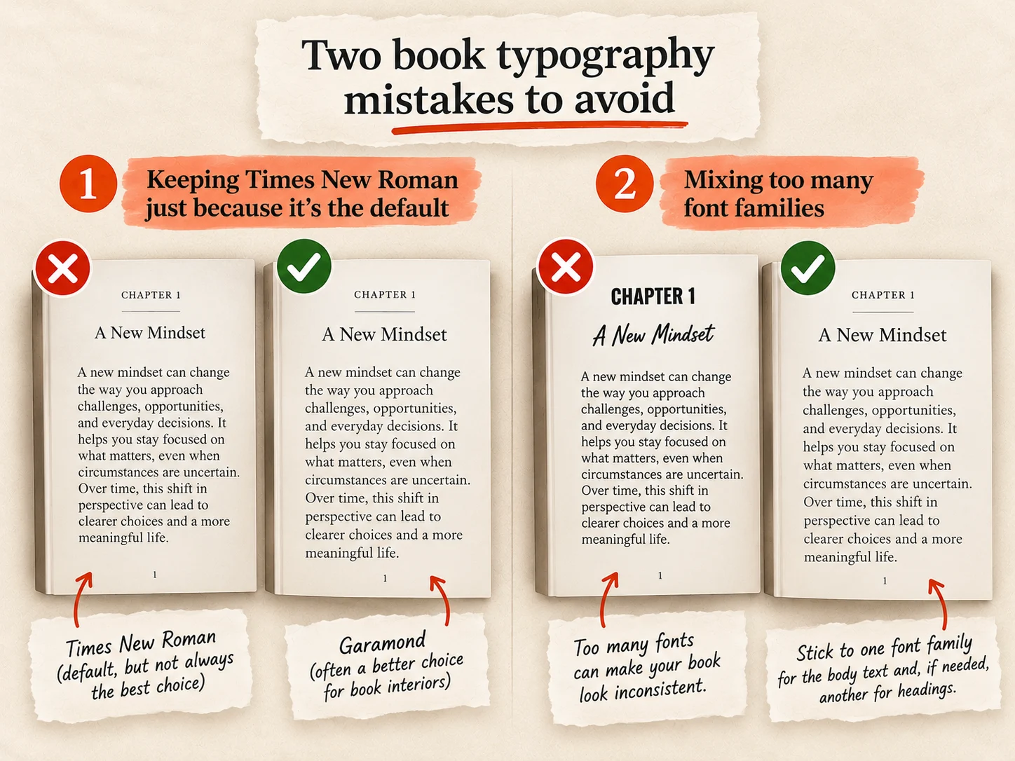
1. Keeping Times New Roman just because it's the default
Times New Roman is perfectly acceptable for writing and submitting manuscripts. It's familiar, readable, and widely supported. But that doesn't automatically make it the best choice for your finished book.
A professionally typeset interior may look better with Garamond, Caslon, or another font designed for extended reading. Before settling on Times New Roman, compare a few typefaces on actual printed pages. The difference can be more noticeable on paper than on your screen.
2. Mixing too many font families
Using three or four unrelated fonts can make your book feel inconsistent, especially when headings, quotes, and callouts all look different.
Stick to one font family for body text and, if needed, another for headings. Bold, italics, and different weights can establish a clear hierarchy without adding more typefaces.
How to check your book's typography before publishing
Before committing to a font, format five to ten representative pages from your manuscript. Include regular paragraphs, chapter headings, quotations, lists, and any tables or diagrams your book contains.
Check whether the text feels comfortable to read. Pay attention to line length, leading, margins, and how crowded or spacious each page looks. Print your sample at the intended 6 × 9-inch trim size rather than judging everything on a screen.
Look closely at bold and italic text, curly quotation marks, punctuation, and special characters. Some fonts handle these details better than others.
Before uploading to Amazon KDP, confirm that all fonts are embedded in your final print PDF.
If you're exporting through Built&Written, apply the same checks to the generated file.
Frequently asked questions
Most traditionally typeset books use serif fonts. Popular choices include Garamond, Caslon, Baskerville, Minion, and Sabon. There's no universal standard, and publishers choose fonts based on the book's content and design.
Garamond is a strong starting point for many nonfiction books. However, the best font depends on your genre, trim size, page layout, and intended reading experience.
Most adult nonfiction books work well with 10.5–12-point body text. Smaller trim sizes may require adjustments to font size, margins, and line spacing to maintain comfortable reading.
Yes. Times New Roman is acceptable for printed books and permitted by Amazon KDP. However, fonts designed for book typography may produce a more polished interior.
No. KDP allows different typefaces but requires a minimum font size of 7 points and embedded fonts in paperback interior files. Authors must also have the appropriate font licences.
Yes. Google Fonts are open-source and can be used commercially, including in books. Check the individual font's licence, particularly when embedding fonts in ebooks or redistributing font files.
About the author

Polina Karlashchuk
More in Book Formatting
Ready to write your book?
Turn your expertise into a professional book with Built&Written.